ExpressionEngine CMS existed for 10 years without a designer. In that time the system built up a substantial design debt, and began to show its age and lack of focus. I joined the project in 2011, tasked with improving and modernizing the product; With a heavy emphasis on iteration, and improvement over time.
Fortunately, I have an extensive background using ExpressionEngine CMS to build websites for clients; Which gave me a unique insight, from a customer’s point of view.

From day one I approached the project as an exercise in long term iteration. I believed that ExpressionEngine, and its customers would be better served by taking smaller, more focused steps towards reducing its design debt.
Goals and dreams
Every section, feature, and UI element needed to be rethought, redesigned, and redeveloped. For the first iteration I focused on creating a reusable, beautiful, and modular design system. I wanted to give the team something to build from. A new foundation so to speak.
I approached the initial CP redesign with these key concepts in mind; Which guided every decision made for the UI.
- Modular, and Consistent
- New, but Familiar
- Iteration, and Improvement
Where to start?
My first real step was to see what the customers, and daily users of ExpressionEngine thought about the system they had been using for years. How did it work for, and against them? Which features would they like to see added, and which could be removed?
I set up a mini-site with a questionnaire, a feedback form, and a way for customers to add feature requests and vote on them. I gathered a tremendous amount of data from this, and it gave me an excellent starting point for rethinking the control panel, with real world data.
Applying what I learned
The next step was to wireframe, sketch, and plan control panel views and features. This included individual UI elements, as well as full page layouts.
At the end of the day, ExpressionEngine has two primary view types. Content listings, and Forms. I focused the UI plan around these two types of views, which allowed me to cover 80% of the control panel UI design quickly and efficiently.

For specific UI elements, like form fields, navigation, and pagination I used a combination of design unit testing and the nine states paradigm to make sure I wasn’t repeating myself too often, and was covering all the possible states for each element.

Using the feedback, and data I gathered. I employed the processes detailed above and quickly arrived at a solid first iteration of the CP. Launch ready, stable, flexible and capable of quick iteration and improvement.
ExpressionEngine 3 was an improvement over its predecessor in every way. From UI to UX, to the modern, responsive control panel that allowed users to manage their content on the go; But, there is always room for improvement…

The future and beyond
Version 3 of the ExpressionEngine launched in late 2015. Since then I’ve continued to iterate on the UI and UX in large and small ways alike.
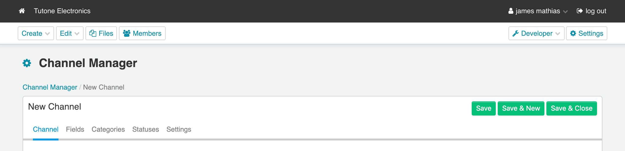
We’ve had seventy-nine releases since version 3.0, currently on version 5.1.3. The Channel Manager had an enormous overhaul, that included reducing friction from install to publishing by allowing site builders to set up a fully functional Channel from a single form, no longer are you required to jump back and forth between multiple forms. Other improvements include improving the contrast, and accessibility of the UI, and a robust bulk content editing feature.

My role
For this project, I practiced UX Design (research, wireframes, and user journeys), UI Design, HTML/CSS/Javascript. Additionally I managed the project from discovery to launch.
What did I learn?
Just like every project, mistakes were made. If I were starting this project today, I would put less emphasis on front loading user data and feedback, and would administer user testing, and questionnaires more frequently through-out the design process.
In terms of tools, and processes; I would have chosen a different approach for UX Flow charts, explored tool offerings more thoroughly, and developed a better methodology for CSS name spacing.