Age of Steam is a staple in the gaming hobby. Originally released in 2002 by Warfrog Games, It’s often lauded as Martin Wallace’s best design. In support of this claim Age of Steam has its own dedicated annual conference, and there are well over 150 available maps for the game system.
I discovered Age of Steam late. Sixteen years late to be exact. I immediately fell in love with the simple and deep gameplay. Unfortunately, the same could not be said for its aesthetic. The graphic design, usability, and creative direction leave a lot to be desired. The bad visuals leave the game with a poor player experience, so bad, that I stopped a game mid-way through to redesign the administration boards.
Hopes and Goals
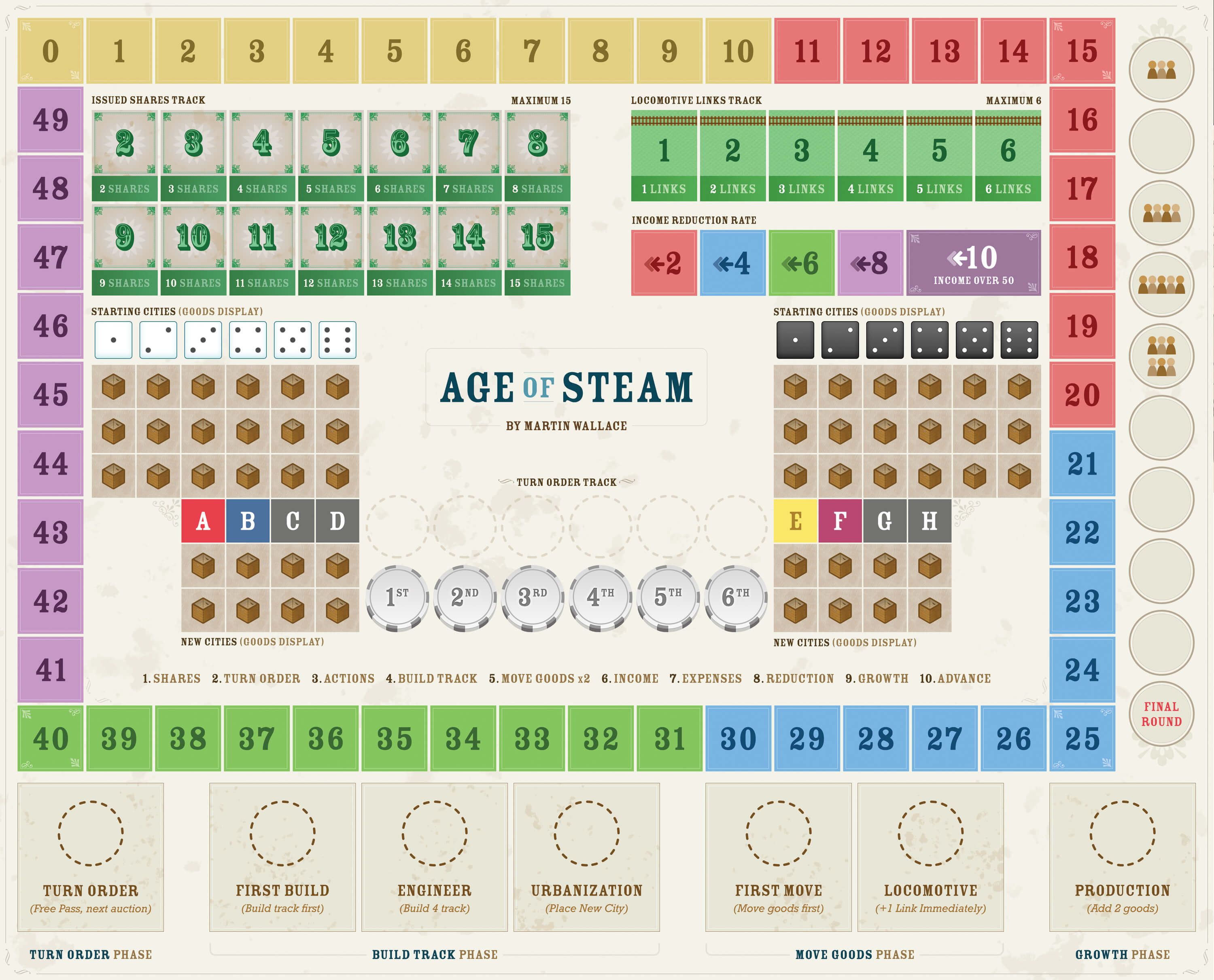
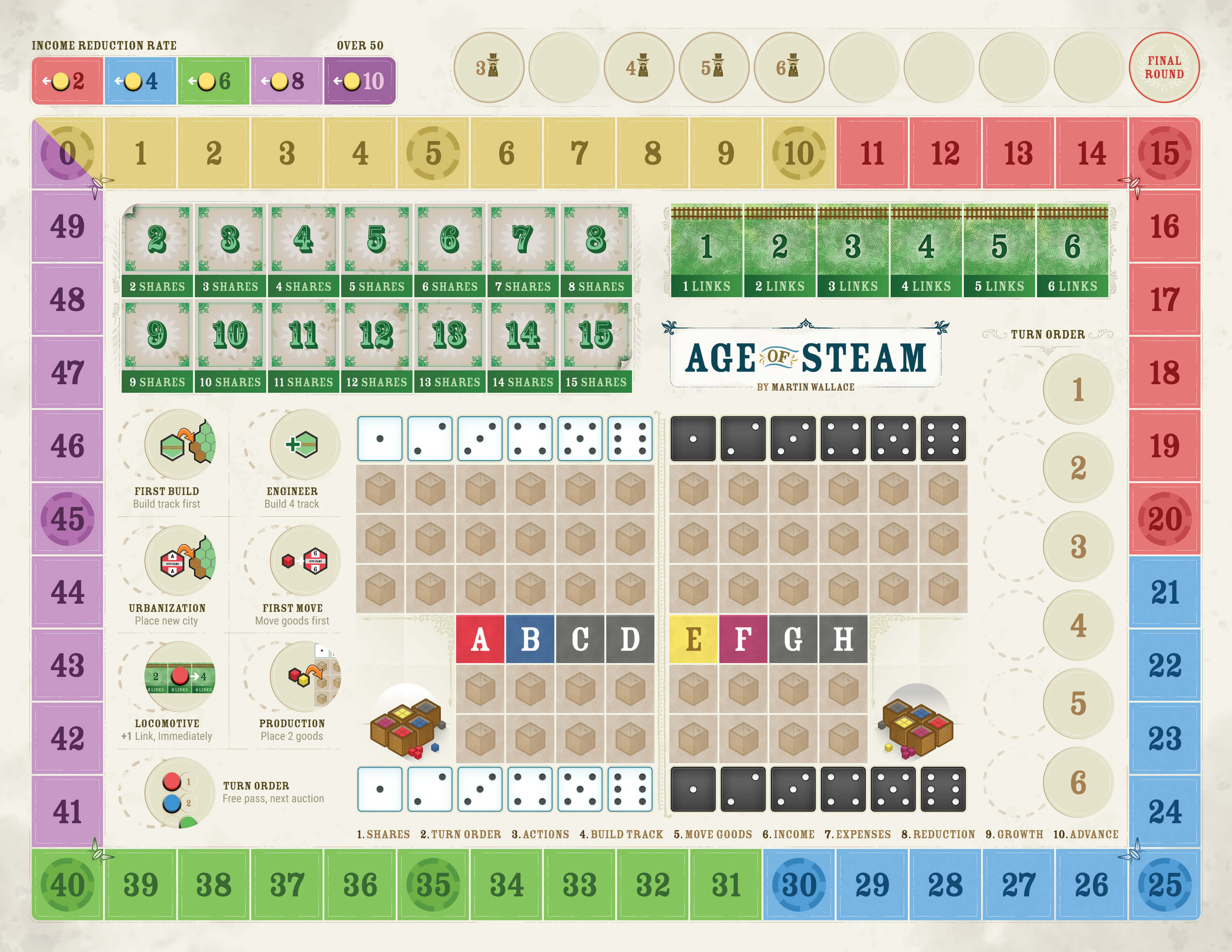
My initial goal with the administration boards was to improve the ability for a player to read the game state at a glance, without needing to move pieces around. This would allow a player to take a faster turn, making informed and better decisions.
I wanted to consolidate the boards into a single board that could be a single point of focus for players during a game.
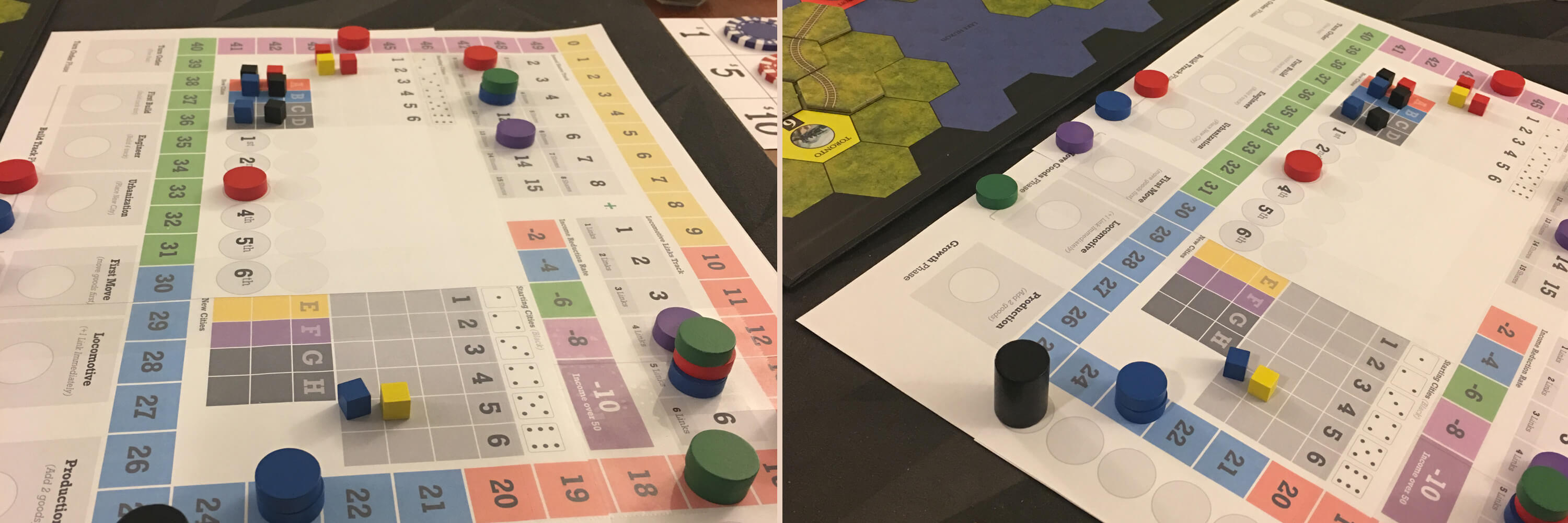
Age of Steam has three areas of focus. The player’s personal area, the map, and the administration area. Reducing the administration area into a single board with all relevant game data makes it easier to track the game state.
Play tests with the new administration board prototypes went well, but there were things that could be improved. I went back to my desk and continued refining the design and layout, and play testing the iterations in order to find the perfect balance of aesthetic and player experience.
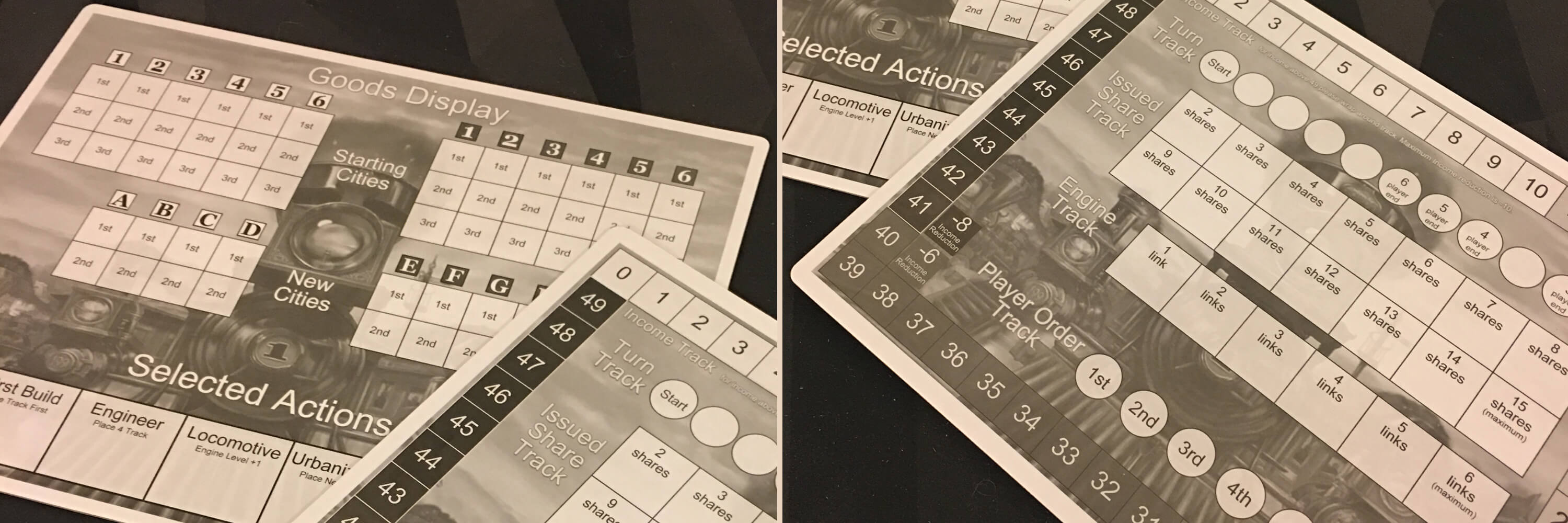
Version 1 of the boards work very well, and I released them to the greater board gaming community for printing, and playing. The only change request I received was for the board to be smaller, so they could print it at home, and fit it back into the box.
Challenge accepted, I believed I could reduce the size without splitting it back into two boards, and without reducing the game play improvements the new board had introduced.
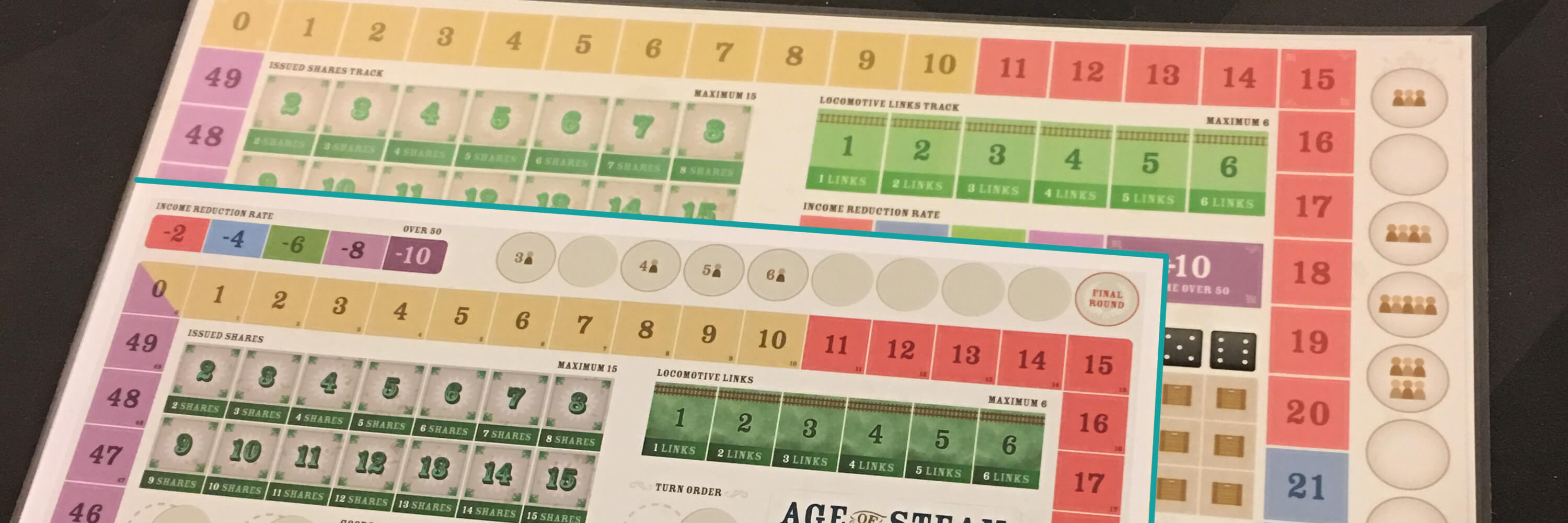
Not only was I able to reduce the dimensions of the printed administration boards by several inches, I was able to improve the player experience by placing the elements together in a more intuitive layout.
I took the opportunity to fine tune the graphic design as well. Adding flourishes, thematic touches, and iconography to represent actions which I use later through-out other redesigned elements of the game.
Is there more?
Yes! I had so much fun redesigning the administration boards, that I didn’t want the project to end so I created player aids and a bank reminder card as well.
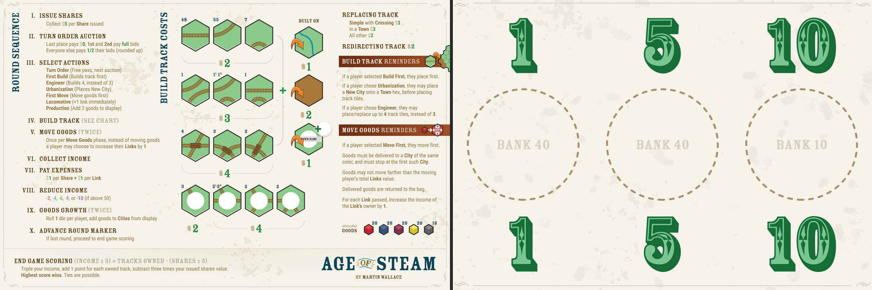
The original game doesn’t come with player aids. These are a new item I created to further improve the player’s experience, by giving them gameplay overviews and reminders. It also gives the player a simplified scoring overview, so they can keep in mind how scoring breaks down in the end game.
The bank reminder allows folks to replace the paper money that comes standard with their own poker chips (a very common practice by Age of Steam players), without having to remember which color chip is which amount. The reminder also tells players how many of each chip the bank should start with, when setting up the game.
Reducing the amount of information the player must memorize gives them more room to make meaningful decisions on their turn. Increasing the quality of a player’s decision by reducing the mental overhead required to play well is a big win.
What about the maps?
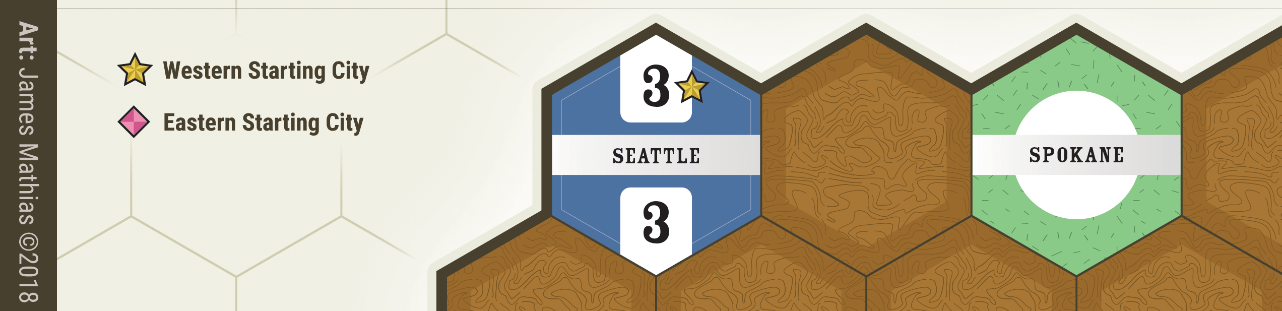
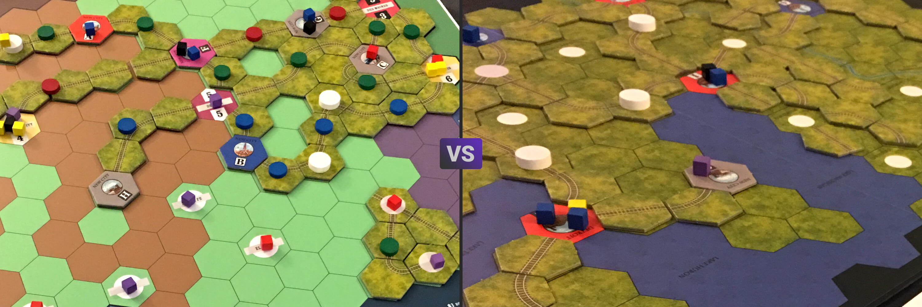
The maps that come with the game are simple in layout and visuals, but their aesthetic is dark, and matches the tiles you lay on top of the map during the game, making it difficult to see who built track and where.
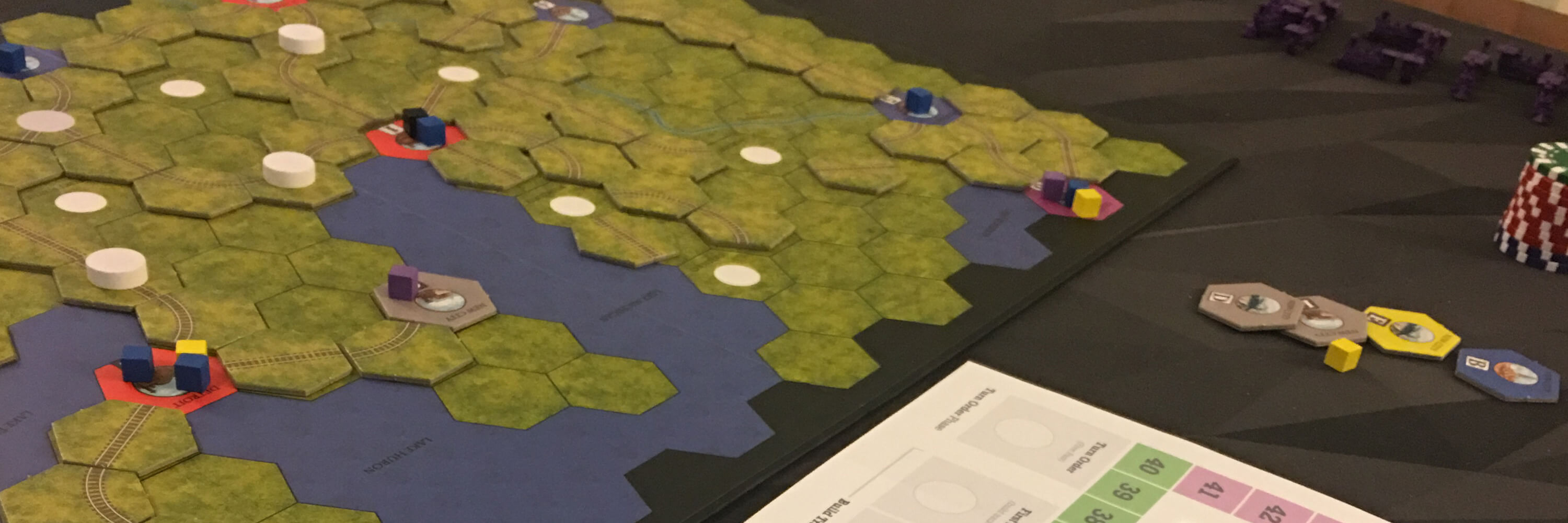
My goal with the maps was to create a high contrast between the map itself, and the tiles you lay on that map, making it very easy to see exactly where tiles have been placed. I strived to create a consistency that could be used across every map in the system, so that there would be a very easy visual language for the player’s to understand, allowing them to pick up any map and instantly know what each type of hexagon was and how it behaved in play.
The original maps for the game have little consistency from map to map. Even the maps that come with the base game have major inconsistencies between them.
A new geography
My first pass at the maps started from a more traditional place. Historically maps for Age of Steam have used a blue or black for the map background, to indicate water or unplayable land surrounding the playable map area, which acts as a high contrast border around the playable area.
Version 1 of the maps was playable and nice looking, but I felt it could be improved, especially if I moved away from tradition.

The contrast of the new map vs the originals is night and day, so much easier to see and track (no pun intended) the game state.
This was a great start, but as I built each new map I found myself having to make compromises on the style guide I had created to accommodate things I didn’t know about when I started.
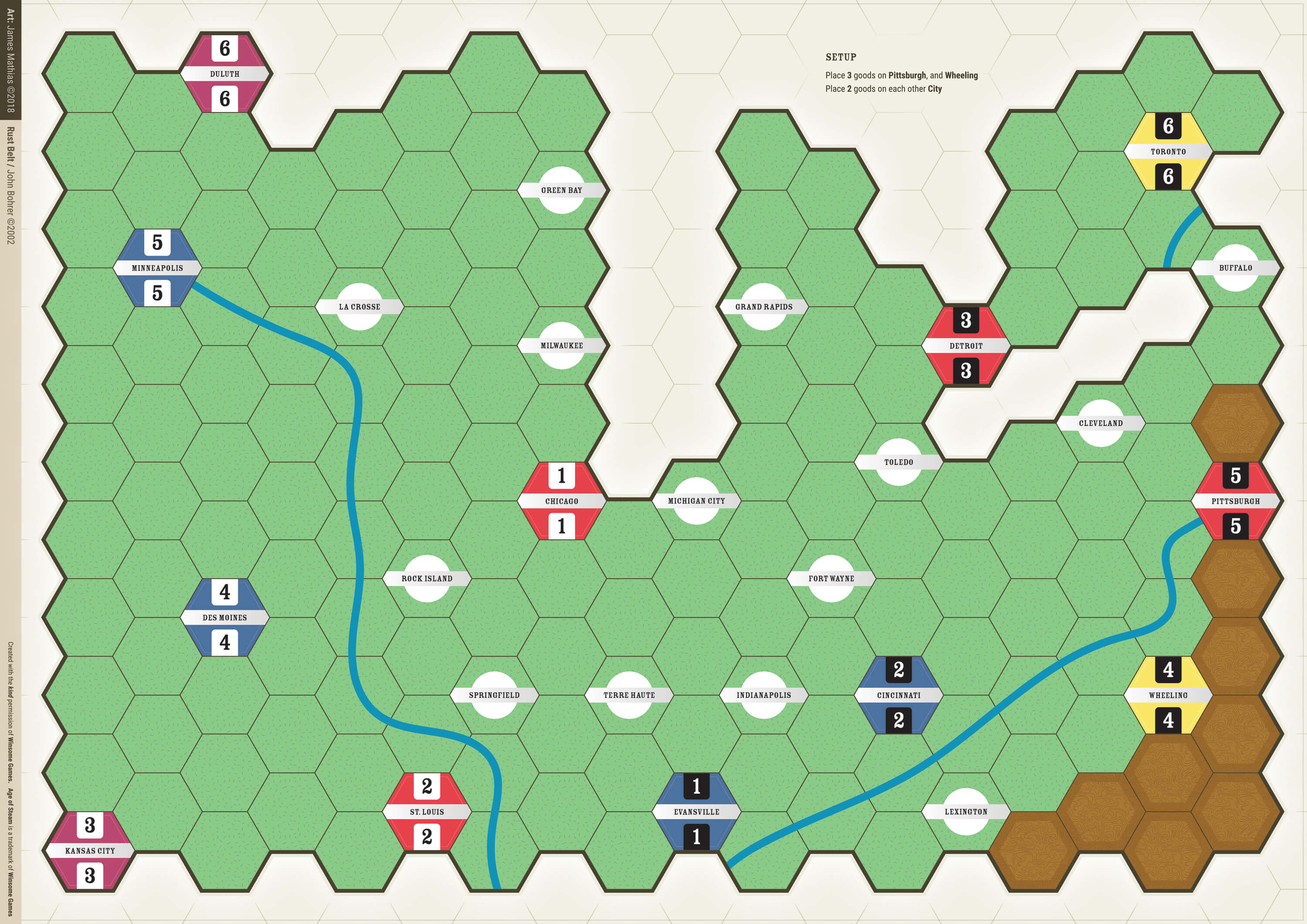
Taking a step back and reevaluating my approach, I redeveloped my map library, so that I could improve the maps and the process of building the maps in one fell swoop. I created a set of map tiles, hexagons. Each tile represents a possible map feature for an Age of Steam map.

Building off the new library, and taking inspiration from my administration board color scheme I redeveloped all the maps into this new style, which increased contrast and thus playability while also improving the visuals and allowing me to maintain more consistency from map to map without compromising the vision of the project.
The new library allowed me to reduce map build time by 2 hours..
My role
For this project, I practiced UX Design (research, wireframes, usability testing), UI Design, Illustration, and Iconography. Additionally I managed the project from discovery to launch and beyond.
What did I learn?
I learned that designing for print is a rewarding but sometimes frustrating process; That I have a knack for applying UX thinking to projects outside the web; And that people appreciate and praise folks for tackling these types of projects.
Since this was a personal, unpaid project that I continue to maintain I have the freedom to adjust and change the way I do things as needed. In terms of what I would do differently, I’m not sure there is anything I would change, as the whole thing was a fun practice and exploration of applying my UX skills outside my comfort zone, so everything happened as it needed to.